
UX Redesign
SAI International School UX Case Study: Simplifying the Admissions Journey
Transforming a confusing, lengthy form into a clear, multi-step process that builds user confidence.
Impact by the Numbers
By reducing cognitive load and clarifying the path forward, we saw immediate improvements in form completion rates and user feedback.
Form Completion Rate
+85%
Support Tickets for 'Process Confusion'
70% ↓
Time to Form Submission
40% ↑
User Confidence Score
2.5 Pts ↑
About the Client
Our Client at a Glance
SAI International School
A top-tier educational institution facing high drop-off rates on a critical conversion path: the online application form.
Project Scope
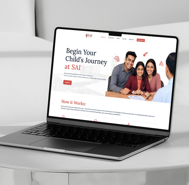
Admissions UX Redesign. The challenge was to transform a single, overwhelming form into an intuitive, multi-step wizard, while clarifying the post-submission journey.

The Roadblocks to Enrollment
Complex Form
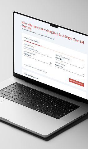
The admission form was presented as one long page, causing 'form fatigue' and high abandonment rates before submission.
Drop-off Rate (First Page)
55%
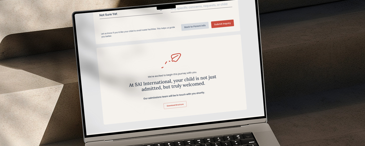
Post-Submission Confusion
The main pain point identified through research: users were confused about the steps after filling the form (interviews, documents, follow-up).
Support Inquiries (Post-Submit)
High
Lack of Process Visibility
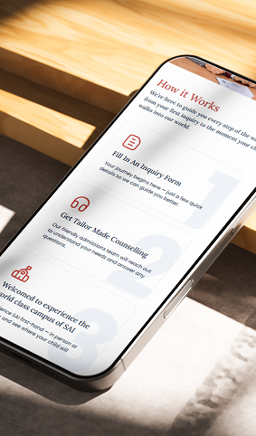
No visual indicator or textual guide existed to explain the overall admissions lifecycle.
Process Clarity Score
Low
The Client’s Vision: Clarity and Guidance
01
Reduce Form Anxiety
Break down the application into manageable chunks to make the task feel less daunting and increase completion rates.
02
Clarify the Entire Journey
Provide a simple, step-by-step map of the entire admissions process, not just the online form submission.
03
Build User Confidence
Use guiding UX copy and predictable design to assure users that they are on the right track at all times.
Our Solutions
Structured Guidance at Every Step
01
Multi-Step Form Implementation
02
Visible Progress and Guiding Copy
03
Clear 'What Happens Next' Flow
04
In-Line Help and Tooltips
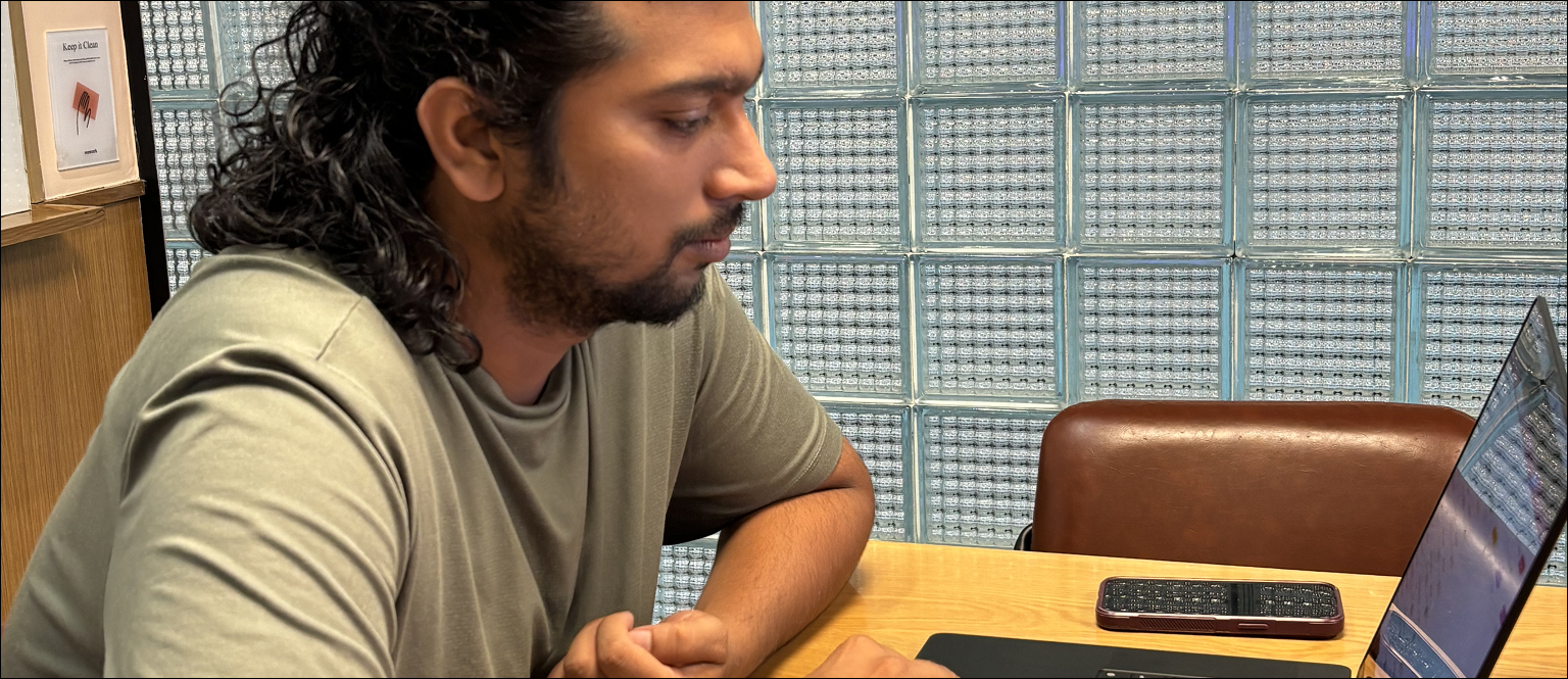
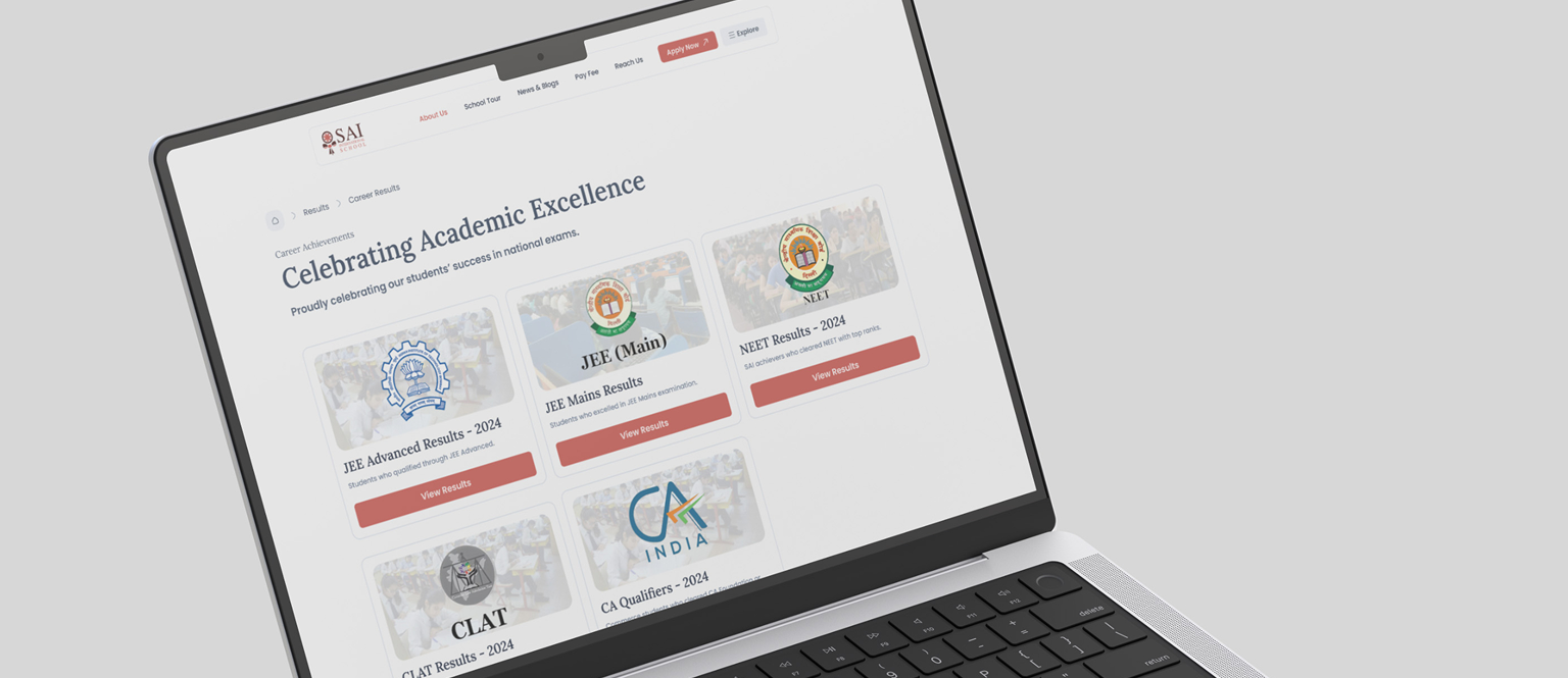
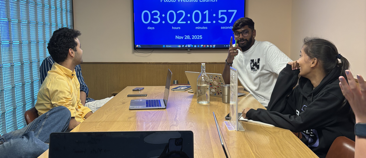
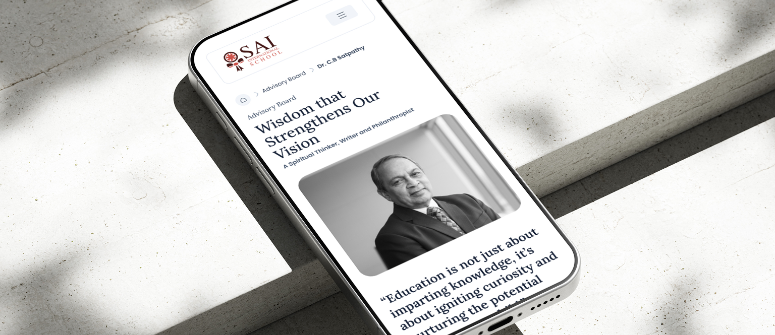
Project Visuals
Behind the Transformation
Key Takeaways
Main Learnings & Highlights
Manageable Chunks Boost Completion
01
The Post-Task Journey is Just as Critical
02
User Research Finds the Hidden Problem
03
Limitations That Guided The Process
Project Timeline
The project carried a firm deadline, pushing the team to stay aligned and deliver on time.
Time taken
125 Hrs
Phase 1
Initial planning and research took place, establishing the framework for the project.
Time taken
50 Hrs
Phase 2
Development and implementation, where the core features were built and tested.
Time taken
75 Hrs
Phase 3
Final review and adjustments, ensuring everything met the quality standards before the launch.
Time taken
30 Hrs